What is Website Navigation?
Website navigation is the structural framework that allows users to move through a website effortlessly, whether to help them:
- Find content or informational resources
- Discover products and services
- Complete conversion-focused tasks, like completing a purchase or booking a call
While sitewide navigation is often attributed to the main navigation menu, other ways exist to explore a website. These include footer links or even internal links found in the content body.
An effective navigation system ensures a smooth website exploration, which improves user experience, reduces frustration, and keeps visitors engaged.
In addition to web design, a good sitewide navigation is a pillar of any SEO-friendly website.
Search engines depend on clear navigation to crawl pages efficiently and understand the site structure.
Moreover, effective website navigation can enhance user behavior metrics on your website, such as lower bounce rate and longer time on site, which can boost its perceived value in Google’s eyes.
Types of Website Navigation Structures for Websites
Here are the five common types of menus used in a website navigation design:
Main menu
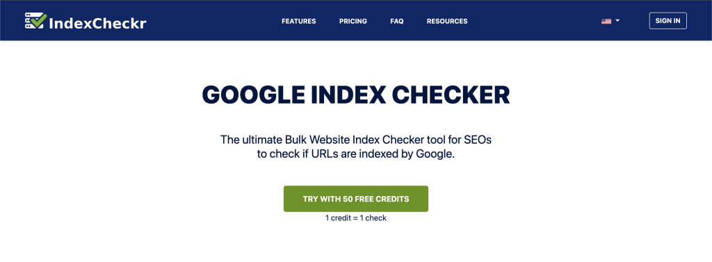
A website’s main menu is the primary navigation system, guiding users to key pages like Home, About, Services, and Contact. Most websites display it as a horizontal navigation bar across the header, such as this one:
Sidebar menu
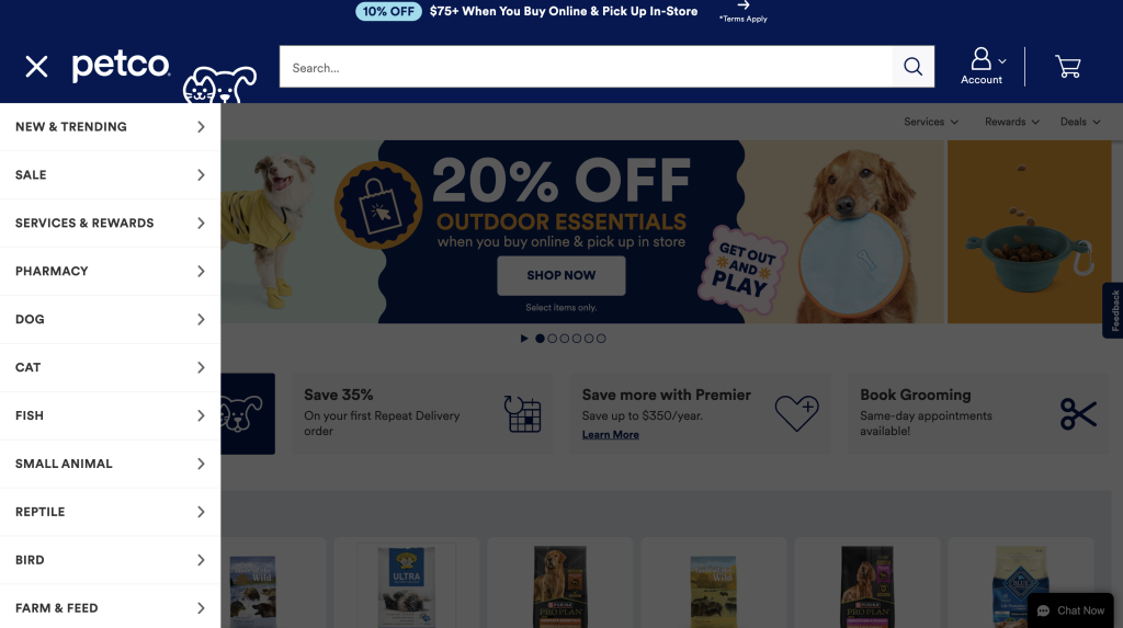
While most websites follow a horizontal navigation menu, large online stores or content-heavy websites use a sidebar navigation system.
These websites typically have many categories, subcategories, and filters. A sidebar menu provides a dedicated space without overwhelming the main content area.
Here is an example from Petco:
Footer menu
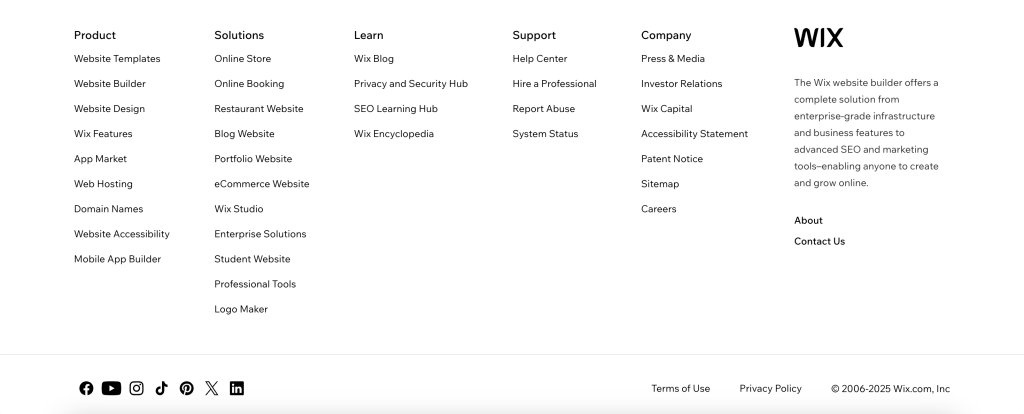
The footer menu is a secondary navigation system at the bottom of a web page. It is meant to complement the primary navigation menu.
Unlike the main menu, which highlights primary pages, footer navigation links provide quick access to details, such as contact information, privacy policies, terms of service, social media profiles, and other minor pages.
Breadcrumbs
Breadcrumbs are another class of secondary navigation item that shows a user’s path and current location in the site hierarchy. They are often found near the top of a page and are frequently used by ecommerce sites.
Breadcrumbs support site navigation by offering a direct route to parent categories, so users will not have to press the back button. This makes navigation more seamless and keeps users engaged in their exploration.
Contextual links
Contextual links, also known as in-text links, are internal links in the content body that take users to related information. Unlike traditional menus, these links blend into the text to guide visitors to relevant pages without disrupting their reading flow.
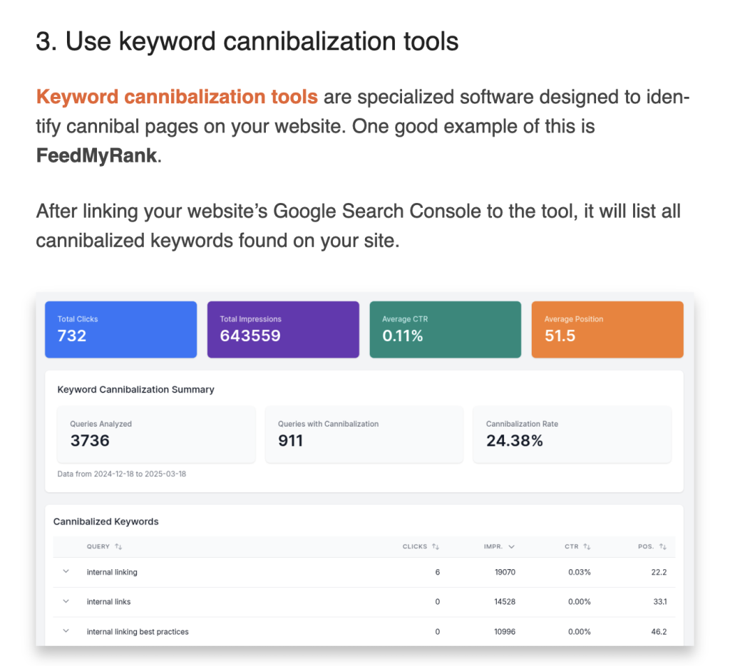
Contextual links enhance website navigation by improving content discovery and encouraging user engagement.
SEO-wise, these links distribute link equity, boost page relevance through descriptive anchor texts, and improve crawlability. Site owners can strategically use contextual links to build thematically related pieces of content, a.k.a. topic clusters.
9 Website Navigation Best Practices for Maximum UX
1. Keep navigation simple and intuitive
Some site owners make the mistake of prioritizing creativity and uniqueness over simplicity and intuitiveness. While this might work for purely creative sites, most domains will benefit more if the main menu is straightforward, visible, and not hidden behind icons or complicated layouts.
Aim for a concise menu, keeping menu items at around 5-7 labeled links. This will help users quickly understand the website’s key pages and reach their desired page in as few steps as possible, without confusion.
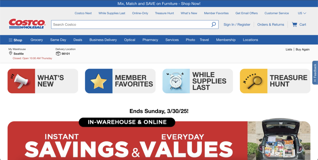
Costco’s navigation menu is a bit cluttered. Aside from having multiple links, the two-layered navigation panel makes it extra challenging to identify the most important pages.
A good example of a simple and intuitive website navigation is Swiss Gear:
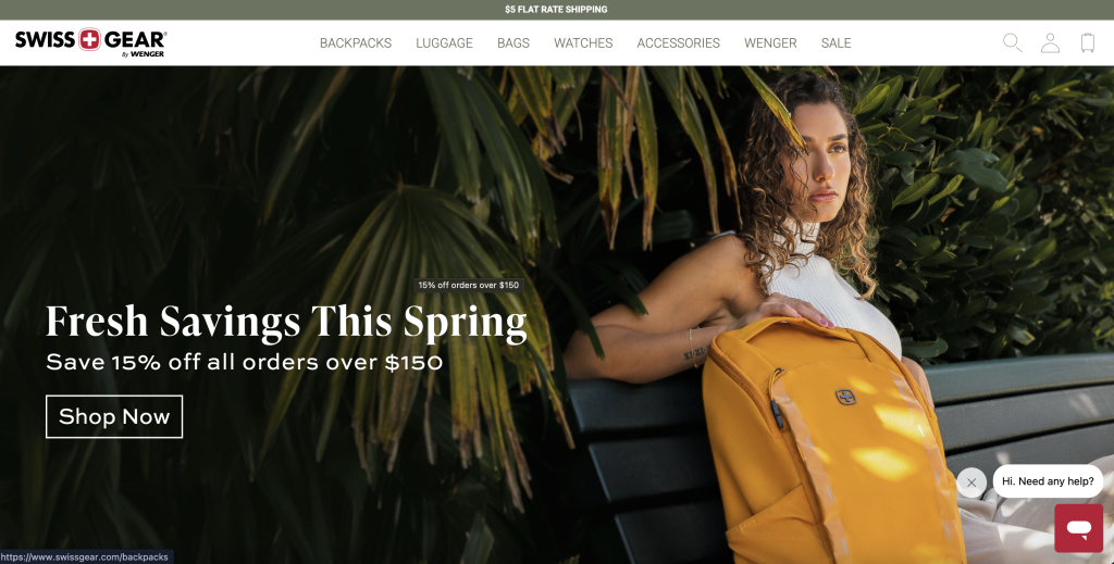
Every product sold is accessible from the top, and your account and cart information are on the far right side of the header.
2. Optimize navigation for mobile
Mobile optimization is a non-negotiable for effective website navigation, especially since most users will search on mobile devices rather than desktops. The key is to modify your navigation system and website design to adapt to smaller screens seamlessly.
For instance, instead of showing all menu links on the header, employ hamburger navigation menus or bottom navigation bars for easy access.
Finally, prioritize touch-friendly designs, like adequately sized buttons with enough spacing to prevent accidental taps.
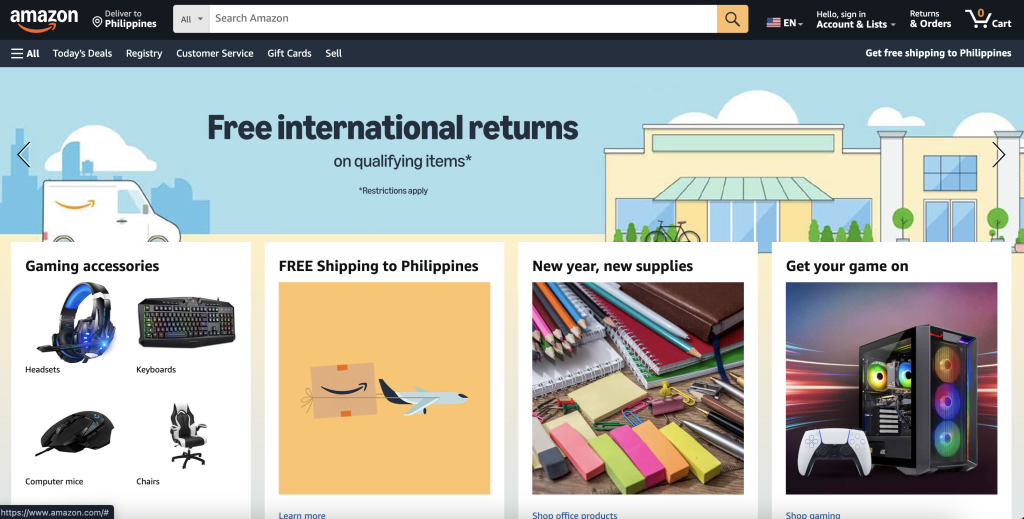
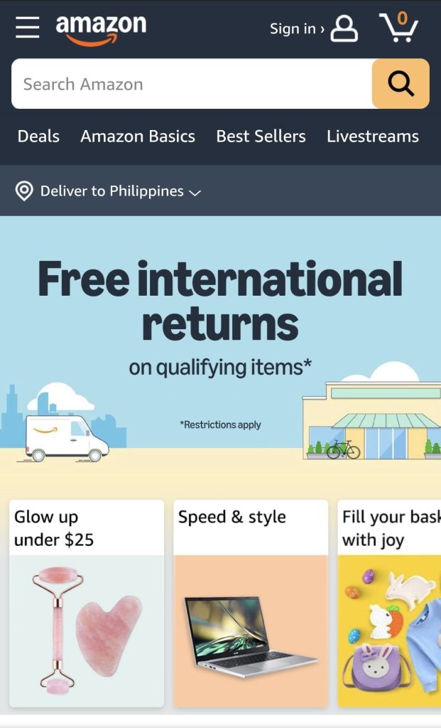
Here is a comparison of Amazon’s website on desktop and mobile.
Desktop version:
Mobile version:
3. Make your navigation bars visible
It might seem elementary to include this, but even household brands can sometimes overlook contrast guidelines. This negatively impacts user experience as users will be forced to squint to see the main menu.
One prime example is the Canadian-based furniture company, Gus*:
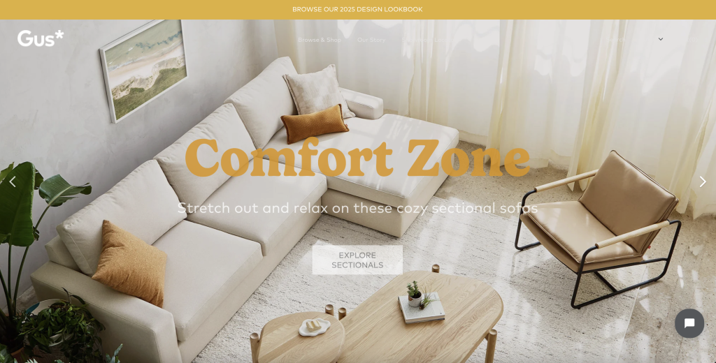
While the main menu is highlighted when you hover the mouse over it, many visitors might not see the link text enough to bother. Choosing text colors that are easily distinguishable from the background is paramount.
4. Save buttons for calls to action
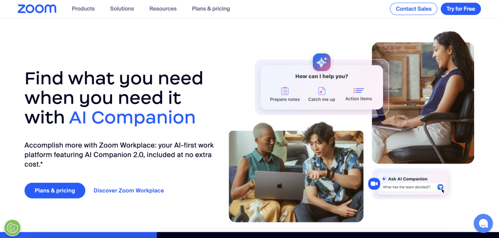
Buttons are special elements useful for drawing attention. They are ideally reserved for important links, such as calls to action (e.g., “Book A Call” or “Contact Us”), and must be used sparingly throughout the website.
The goal is to create visual separation between regular link text and your CTA.
One not-so-good example is Greek Sandals. Their main menu buttons blend in with the CTA, creating zero distinction between other links.
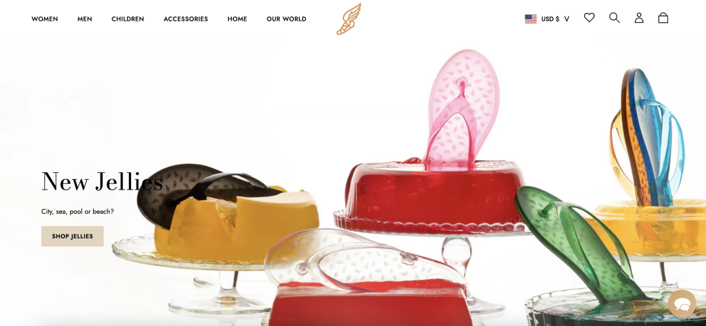
Meanwhile, Zoom uses CTA buttons effectively, making it unique compared to other buttons:
5. Use a dropdown navigation menu if necessary
Dropdown menus are helpful for content-heavy websites or for organizing complex information into sensible categories.
For instance, a full-service digital marketing agency might have blog posts on all marketing facets, such as social media marketing, search engine optimization, PPC advertising, and web development. Having a dropdown menu that segregates each collection can help visitors find their desired resource quicker.
One good example of a website using a dropdown is Kadence, where they divided their Knowledge Hub into several categories (resources, reports, blogs, etc.).
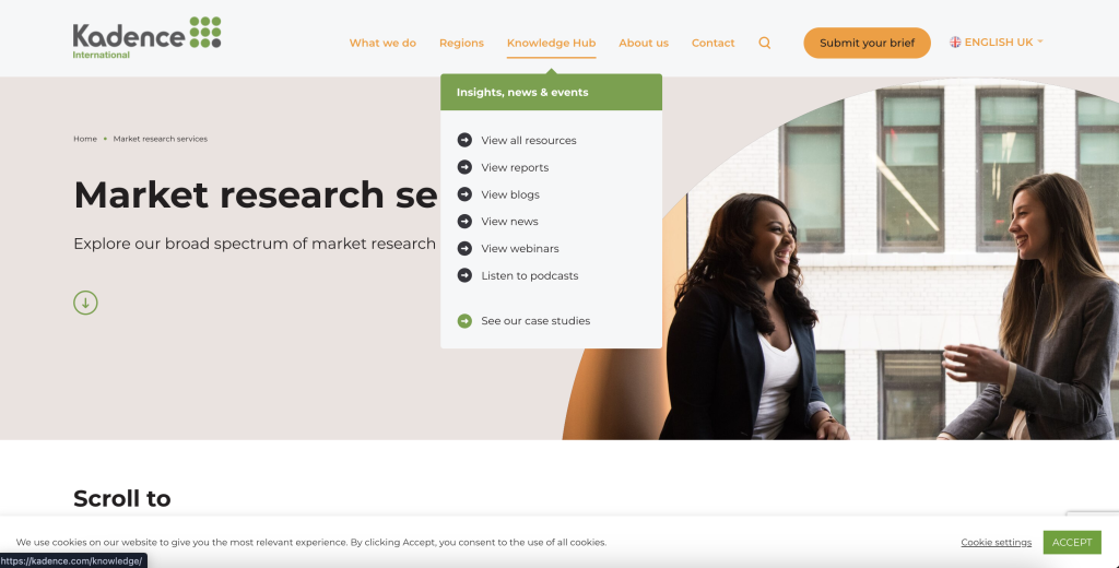
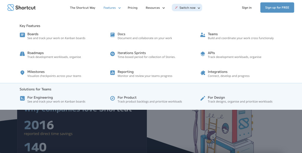
However, if you want to feature additional subcategories, avoid implementing cascading dropdowns. These are multilevel dropdowns in which submenus expand when you hover or click the parent dropdown.
Instead, use mega menus with a list of categorized links and other essential details. Here is an example mega menu from Shortcut, a project management tool for software developers:
6. Arrange links in order of priority
When organizing navigation links, place the two most important links on both ends of the navigation menu. This is due to the psychological phenomenon called the serial position effect, which states that people are likely to remember the first (primacy) and last (recency) items in a sequence.
On many websites, we notice the CTA button in the right-most section of the navigation menu. Your website likely follows suit as well. If so, identify the most crucial link, such as the products, features, or solutions pages, and then place it on the other end.
Take a look at how we arranged LinkStorm’s navigation menu:
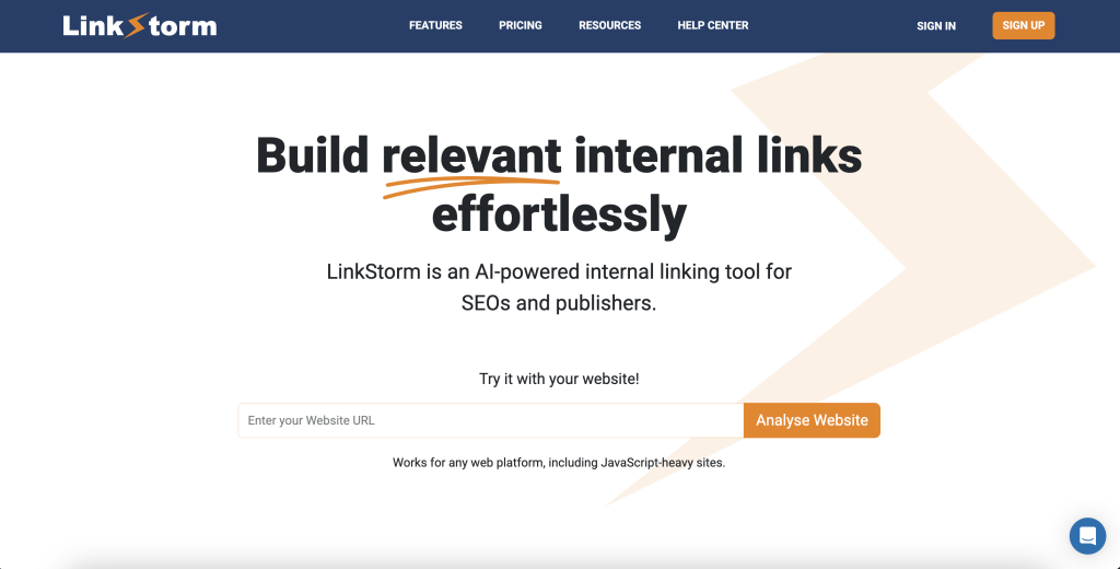
We started with the Features since this is where most site owners will be interested in knowing.
Toward the end, we placed the Sign Up CTA button for if they are ready to try LinkStorm for 14 days FREE.
7. Build highly relevant contextual links
Contextual links should be naturally integrated within the text without disrupting the content’s prose or flow.
Here are two ways to ensure your contextual links are highly relevant:
First, make sure the linked pages are semantically related. That means you shouldn’t link a page about coffee jelly frapuccino to another page about the lochness monster. It just doesn’t make any sense.
Secondly, use keyword-rich and descriptive anchors. Search engines and site visitors depend on anchor texts to understand the linked page’s context without having to follow the link. More importantly, Google uses anchor texts as a factor in quantifying link equity distribution.
While building internal links can be done manually, this process is not scalable and practical in the long run.
This is where internal linking tools come in.
LinkStorm is an AI-powered internal linking toolkit that automatically finds relevant internal links across your website using semantic analysis.
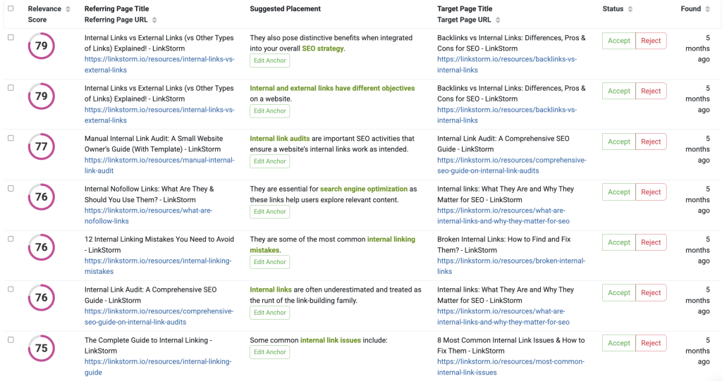
Accepting links is as easy as one click, and the suggestion is automatically embedded in your content in real time. This takes the tedium out of internal linking, allowing you to focus on other business activities or marketing facets.
8. Let users know where they are on your site
Navigating a website can sometimes be tricky, especially for large ecommerce websites with multiple categories, subcategories, and products.
Suppose a shopper visits a product but realizes it didn’t check all the desired boxes. They will likely check alternative products under the same subcategory or a different category altogether.
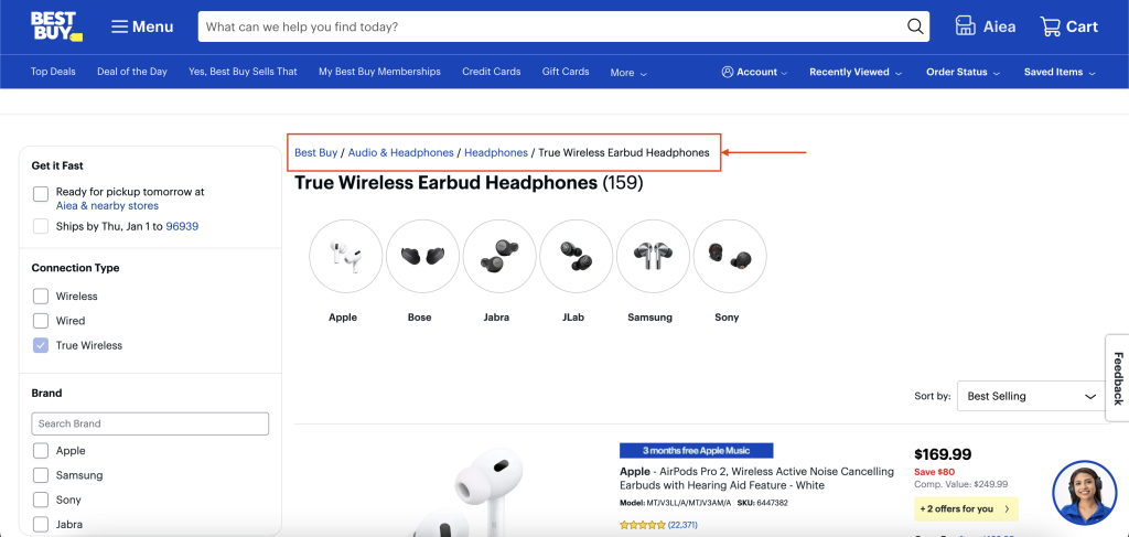
Instead of using the search bar or pressing back, breadcrumbs are good navigation tools that allow users to see their current location on the website and backtrack to their desired category.
Best Buy effectively implements this on their website, as shown below:
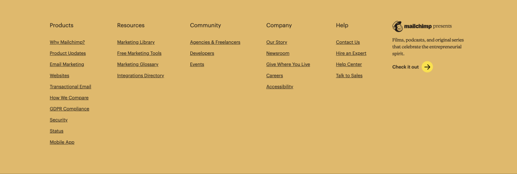
9. Don’t forget the footer links
Footer links are secondary navigation systems found at the bottom of the page. While they are less crucial than header links, they can be essential in certain situations.
For instance, a website visitor reaches the bottom of the website. Footer links reinforce the information in the primary navigation system, encouraging users to explore the website further.
In addition, some users might want to check the website’s privacy policies and terms of service before interacting with it. Most legal compliance documents are in the footer.
Here is an example of footer links:
Internal Links are Essential for Seamless Sitewide Navigation
Many site owners think navigation is limited to primary and secondary navigation menus, but there’s more to them than meets the eye.
Any element that boosts the accessibility of your website is a kind of website navigation tool. One of the most prominent examples is internal links.
LinkStorm can automatically build those internal links on your behalf.
With highly relevant internal links, you support sitewide navigation by guiding users to valuable sources of information that align with their search intent.
Try LinkStorm now for 14 days FREE—no credit card requirements, no strings attached.

Leave a Reply